Seismo Blog
Where the Hazard is Highest
Categories: Bay Area | Probabilistic Analysis
April 7, 2015

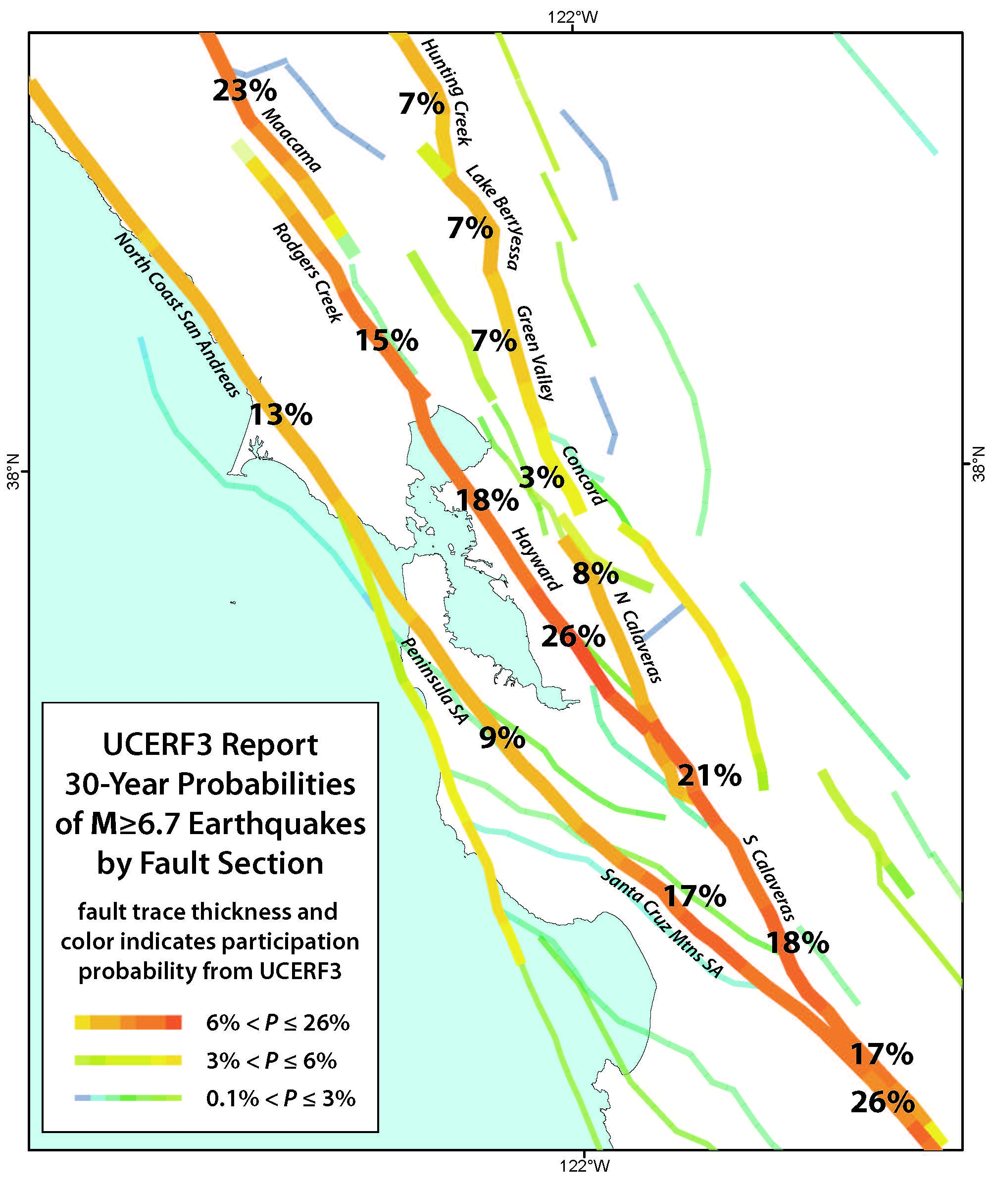
UCERF Bay Area map (Click to view larger image.)
Where is the most hazardous place to live in the Bay Area? That's a difficult question to answer, because it all depends on the type of risk one is taking into account. A map showing the likelihood of becoming a victim of violent crime will look very different from a map of all fatal traffic accidents or a plot of the geographical distribution of heart attacks that happen while the victim is jogging. Thanks to the efforts of dozens of Earth scientists from many institutions, we now have a much better map of another danger lurking beneath the Bay Area - the hazard associated with earthquake ruptures. This new map clearly shows a distinct distribution of hot spots and low risk areas.
As described in several previous blogs, these regional details are part of a much larger effort, the "Uniform California Earthquake Rupture Forecast" (UCERF-3), which was published last month. For this forecast, researchers computed the probabilities that potentially damaging earthquakes - those with magnitudes larger than 5 - will strike various parts of California within the next 30 years. For the Bay Area, scientists divided the known faults of our region into approximately 100 smaller sections and looked at the likelihood that each of them might rupture in a quake.
The accompanying map - compiled by Jack Boatwright from the USGS office in Menlo Park based on the UCERF-3 modelling - shows the major faults in the Bay Area in different colors. All faults in blue and green have a very low hazard of rupture, below 3 percent. Yellow faults have a risk that is up to twice as high. But still, a 6 percent chance translates into a rather unlikely event. However, once the colors are range and red, the probabilities become significant. Three fault segments with the reddest colors - hence the greatest likelihoods of rupture - stand out. In the far north it is the Maacama Fault, which runs parallel to the San Andreas Fault far inland in Mendocino County. It has an almost 25 percent chance of generating a large quake in the coming three decades. The San Andreas Fault to the south beyond Hollister has an even slightly higher likelihood of rupture. Fortunately, both of these fault segments cross areas with relatively sparse population. Since "risk" is defined as the product of "hazard" times "vulnerability", the risk is lower in rural areas.
In contrast, the third fault with a similarly high probability cuts though the heart of a very densely inhabited part of the Bay Area. The southern Hayward Fault, which extends along the East Bay foothills between south of Fremont and San Leandro, has the highest likelihood of giving way. One of the reasons for its high probability is the fact, that this segment has not ruptured in a significant quake since 1868. Since then tectonic stress has accumulated and according to the latest UCERF model there is a 26 percent chance it will give way in the next 30 years. A detailed scenario of what's is in store for us, when we experience a repeat of the 1868 earthquake, is described in a previous blog - and the news is not good.
However, there are some pieces of positive information in the UCERF map. The San Andreas Fault, the mother of all earthquake faults in California, shows a much lower probability of rupturing than the more hazardous faults further inland. Particularly along the Peninsula and further south, the chances of a large quake are only 9 percent. The reason lies in the not so distant past. In 1989 the Loma Prieta Quake relieved the fault of a good amount of tectonic stress. Even though that quake occurred more than 25 years ago, its relaxing effect on the Earth's crust is still being felt. (hra100)
BSL Blogging Team: Who we are
Recent Posts
-
: Alerts for the Whole West Coast
-
: Destruction in the Eastern Aegean Sea
-
: An Explosion in Beirut heard all over the Middle East
View Posts By Location
Categories
- Alaska (3)
- Bay Area (24)
- Buildings (3)
- Calaveras (4)
- California (13)
- California ShakeOut (3)
- Central California (4)
- Chile (4)
- Earthquake Early Warning (10)
- Earthquake Faults and Faulting (44)
- Earthquake Science (3)
- Haiti (3)
- Hayward (12)
- Indonesia (4)
- Induced Seismicity (3)
- Instrumentation (18)
- Italy (6)
- Japan (7)
- MOBB (3)
- Mendocino Triple Junction (5)
- Mexico (7)
- Nepal (3)
- North Korea (5)
- Nuclear Test (5)
- Ocean Bottom Seismometer (3)
- Oklahoma (4)
- Plate Tectonics (18)
- Preparedness, Risks, and Hazards (16)
- Salton Sea (3)
- San Andreas Fault (14)
- Seismic Waves (13)
- Seismograms (4)
- ShakeAlert (3)
- Southern California (5)
- Surface Waves (3)
- Today in Earthquake History (20)
- Volcanoes (4)
- subduction (3)